

Revenue operations metrics are the shared numbers that tell you whether your whole go-to-market system is working, not just whether one team had a lucky month. If your pipeline feels busy but revenue still comes in lumpy, revenue operations metrics help you spot the friction earlier, before a missed month turns into a bigger problem.
What Revenue Operations Metrics Actually Are
At a simple level, revenue operations metrics are the numbers that connect marketing, sales, and customer success into one picture. Instead of asking, “Did marketing bring in leads?” or “Did sales close deals?” you ask a more useful question: “Is the full path from first touch to renewal working the way it should?”
That distinction matters a lot once your SaaS business is past the very early scramble and into the awkward, real scaling stage. Around $1M to $5M ARR, you usually have enough moving parts for handoffs to break, forecasts to drift, and pipeline to look healthier than it really is. One team can hit a local goal while the overall system gets worse. More leads. Slower follow-up. More demos. Fewer qualified opportunities. Bigger pipeline. Lower win rates. You can feel the problem even before you can name it.
That is exactly what good RevOps metrics are for. They act like a dashboard light in your car. You do not need 40 lights blinking at once. You need the few that tell you where friction is building so you can fix the cause, not just stare at the outcome.
The metrics that matter most are not the prettiest ones. They are the ones that help you make a decision this week.
Why Most RevOps Dashboards Get Too Big Too Fast
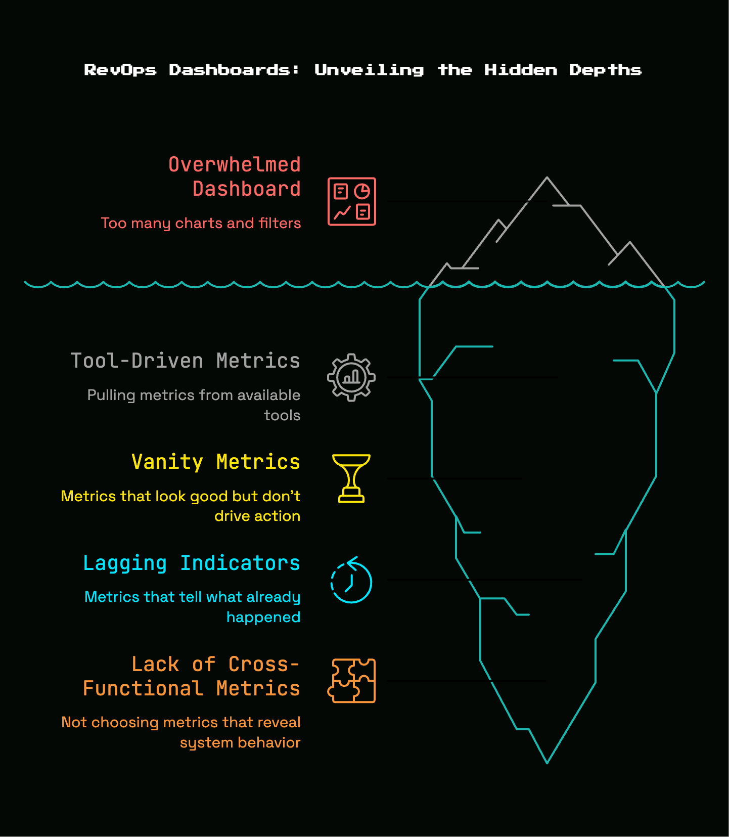
Most early RevOps dashboards start with good intentions and end up looking like a kitchen junk drawer. A little pipeline reporting here, a few marketing charts there, maybe a retention view bolted on later. Before long, you have 25 charts, three filters, four definitions of “qualified,” and no clue what to fix next.
Here’s the thing: more charts do not create more clarity. They usually create cover. When everything is measured, nothing gets attention.
This happens because early teams often pull metrics from the tools they already have instead of from the decisions they need to make. Your CRM gives you stage counts. Your marketing platform gives you campaign traffic. Your billing system gives you revenue. So the dashboard becomes a collage of available numbers rather than a view of operating health.
The fix is not fancy software. The fix is choosing cross-functional metrics that reveal system behavior. Those are the numbers that show whether leads are being picked up, whether opportunities are moving, whether forecasts can be trusted, and whether customers stay long enough for acquisition spend to make sense.
Vanity metrics vs. operating metrics
Vanity metrics look good in a board slide and rarely change anyone’s behavior. Raw lead volume is a classic example. If 500 leads came in last month, that sounds encouraging. But if only a handful were a fit, or if most sat untouched for two days, lead volume tells you almost nothing useful.
Operating metrics, by contrast, force action. Lead-to-opportunity rate tells you whether lead quality and qualification are working. Lead routing accuracy tells you whether the handoff system is broken. Forecast accuracy tells you whether your CRM reflects reality or optimism.
Booked revenue can also become a vanity metric when you use it alone. Closed revenue matters, obviously. But as an operating metric, it is late. By the time closed revenue dips, the real issue may have started six or eight weeks earlier with weak lead response, stalled opportunities, or sloppy close dates. That is why forecast variance matters more than a simple “we closed $X.” It tells you whether your revenue process is predictable or just occasionally fortunate.
A useful test is simple: if a metric moves, do you know what action it should trigger? If not, it probably does not belong on your core dashboard.
Leading indicators vs. lagging indicators
Lagging indicators tell you what already happened. ARR, closed revenue, churn, and bookings fall into this bucket. You need them. You just cannot rely on them alone because they arrive after the damage is done.
Leading indicators tell you what is likely to happen next. Speed-to-lead, stage conversion, pipeline movement, slippage, and response coverage all give earlier signals. These are the numbers that whisper before revenue starts shouting.
Think of it like catching a flight. ARR is whether the plane landed. Speed-to-lead is whether you left the house on time. Stage conversion is whether you got through security. Pipeline slippage is whether the departure board keeps pushing your gate later and later. One view tells you the outcome. The other tells you where the trip is going sideways.
For an early-stage SaaS team, leading indicators are usually more useful week to week because they give you time to intervene.
The Short List: Revenue Operations Metrics That Actually Matter
If your company is between roughly $1M and $5M ARR, you do not need 25 KPIs on day one. You need a short list that covers the full system: acquisition, conversion, pipeline health, forecast quality, retention, and data trust.
That short list is enough to answer the questions that actually run the business. Are good leads getting touched fast? Are leads turning into real pipeline? Is pipeline moving with enough speed and quality to support the forecast? Are customers staying and growing? Can you trust the data at all?
This is the core idea behind revenue operations metrics. Not “track everything.” Track the few numbers that connect behavior to revenue.
Speed to Lead
Speed to lead measures how quickly your team responds when an inbound lead shows intent. For early-stage B2B SaaS, this matters more than most founders expect, because every demo request or high-intent form fill is valuable. Miss the timing, and the moment cools off fast.
The research here is blunt. Teams that respond within one hour are 7x more likely to qualify a prospect than teams that wait two hours, and leads contacted within five minutes are dramatically more likely to convert. Exact benchmarks vary by market and sales motion, but the direction does not. Faster follow-up wins.
This is one of the best early RevOps metrics because it reveals operational discipline, not just rep effort. If speed-to-lead is slow, your revenue engine is leaking at the very top.
What to measure
Start with first-response time. That tells you how long it takes from lead creation to the first human follow-up. Then look at median response time, not just average. Median is usually more useful because one weird outlier, like a lead that sat untouched all weekend, will not distort the picture as badly.
SLA adherence matters too. An SLA, or service-level agreement, is just the rule for acceptable response time. For example, inbound demo requests must be contacted within 15 minutes during business hours. Your metric is the share of leads that met that rule.
Those three views together tell a fuller story. First-response time shows actual delay. Median keeps the number honest. SLA adherence shows whether the process is consistently happening or just occasionally happening.
What speed-to-lead problems usually mean
Slow response usually does not mean “sales is lazy.” It more often points to a broken process.
Maybe leads are routed to a round-robin that nobody checks. Maybe ownership is unclear for certain segments. Maybe your first sales hire only works East Coast hours while most demo requests come in after 4:00 p.m. Pacific. Maybe every enterprise-looking lead still gets screened by you, and your calendar is packed from 9:00 to 5:30.
That last one is common. Founder bottlenecks look like a sales problem from far away, but they are really an operating design problem. If your best inbound leads are waiting on one person, your response metric will show it before revenue does.
Lead Pickup Rate and Lead Routing Accuracy
Fast response only matters if the right person actually picks up the lead. That is where lead pickup rate and lead routing accuracy come in.
Lead pickup rate measures how many assigned leads receive follow-up within the expected window. Routing accuracy measures whether the lead was assigned to the correct owner in the first place. Those sound small, almost administrative. They are not. They are health checks on one of the most failure-prone parts of the revenue system: the handoff.
A missed handoff is expensive because it can hide inside otherwise decent top-of-funnel numbers. Marketing sees conversion into inbound. Sales sees enough names in the queue. Yet good prospects still disappear because assignment broke somewhere in the middle.
These are pure RevOps metrics because no single team owns the whole problem. Marketing can generate demand, sales can want more pipeline, and customer success can surface expansions, but if routing logic is messy, the system drops the ball anyway.
Signs your handoff process is breaking
You can usually spot a bad handoff process without a complicated analytics stack. Leads sit unassigned. Two reps email the same account. An SMB lead lands with your founder while a larger target account goes to the wrong territory. A demo request from a healthcare buyer gets sent to a generalist with no context. Nobody is trying to create chaos, but the process still creates it.
Lead pickup rate tells you if assignments turn into action. Routing accuracy tells you if the assignment itself made sense.
If both are weak, fix the plumbing before asking for more lead volume.
Lead-to-Opportunity Rate
Lead-to-opportunity rate is one of the cleanest ways to judge whether your acquisition and qualification process is working. It measures the percentage of leads that become real sales opportunities, meaning not just a contact in your CRM, but an account with enough fit, intent, and progress to belong in pipeline.
A directional benchmark often cited is around 13%, but that number is only useful as context. A founder-led inbound motion with strong product-market fit can be much higher. Broad paid acquisition or lower-intent content channels can be lower. Deal size, sales complexity, and qualification rules all change the shape of the number.
Still, this metric matters because it sits right at the seam between marketing and sales. If lead-to-opportunity rate drops, something upstream or midstream is off. Your targeting may be loose. Your form may be attracting curiosity instead of intent. Your reps may be converting anything with a pulse into “pipeline.” Or your response speed may be too slow to catch high-intent buyers while they are still engaged.
How to interpret a low lead-to-opportunity rate
A low number does not automatically mean bad marketing. That is the trap.
Sometimes it means your qualification rules are too vague, so reps are making inconsistent judgments. Sometimes it means the source mix shifted, like a webinar campaign driving lots of names but weak buying intent. Sometimes it means response is slow enough that good leads cool off before discovery even starts.
It can also mean pipeline inflation. If your team creates opportunities from low-intent sources just to keep the CRM looking full, lead-to-opportunity rate may look fine for one step and terrible a little later. That is why this metric works best when paired with stage conversion and win rate. It should lead to real pipeline, not decorative pipeline.
Pipeline Velocity
Pipeline velocity measures how quickly qualified pipeline turns into revenue. It is one of the most useful revenue operations metrics because it combines several moving parts into one system-level view. Not just how much pipeline you have, but how effectively that pipeline behaves.
Here is the plain-English version: if you have more qualified opportunities, with decent deal sizes, closing at a solid rate, in a reasonable amount of time, velocity goes up. If any of those break, velocity slows down.
That makes pipeline velocity far more useful than staring at total pipeline value. A giant pipeline can still be weak. Pipeline velocity forces honesty.
The four inputs behind pipeline velocity
Pipeline velocity comes from four inputs: number of opportunities, average deal size, win rate, and sales cycle length. That formula matters because it keeps you from chasing magic fixes.
You cannot improve velocity by wishing harder. You improve it by getting more qualified opportunities into the funnel, increasing average contract value without wrecking close rates, winning a higher percentage of comparable deals, or shortening the time it takes to close.
The catch is that every shortcut here has trade-offs. If opportunity count rises because qualification got sloppy, velocity may later get worse. If deal size goes up because you start chasing larger accounts before your product is ready, sales cycles may stretch and win rate may fall. Real improvement has to be real at the input level.
That is why pipeline velocity is such a strong whole-system metric. It punishes fake progress.
Why pipeline velocity beats staring at pipeline volume
Founders often track pipeline created because it feels concrete. “We added $400,000 in pipeline this month” sounds like momentum. But pipeline volume alone can hide all kinds of mess: old deals, unclear next steps, budgetless opportunities, and “just checking in next quarter” placeholders wearing a late-stage label.
Velocity cuts through that.
If pipeline is large but slow, you have friction. If pipeline is growing but win rate is dropping, you have quality issues. If cycle length stretches every month, your process is not scaling cleanly. A smaller, healthier pipeline moving with speed is better than a bloated one that makes everyone feel busy.
Stage Conversion Rate and Funnel Leakage
Stage conversion rate shows how opportunities move from one stage to the next. Funnel leakage shows where they fall out. Together, these metrics are one of the simplest ways to diagnose sales friction without building a giant analytics machine.
Every sales process has natural drop-off. Not every demo should become an opportunity, and not every proposal should close. The point is not to eliminate loss. The point is to know where the loss becomes abnormal.
If the jump from demo to qualified opportunity suddenly weakens, your discovery may be off or your targeting may have shifted. If proposal to close falls apart, pricing, procurement, or value communication may be the problem. If a free trial product is involved, post-trial to paid often reveals whether onboarding and product activation are doing enough.
These metrics only work if stage definitions are stable. If one rep treats “qualified” as “good conversation” and another treats it as “budget, authority, need, timing confirmed,” your conversion numbers become fiction.
Where to look for leaks first
For most early B2B SaaS teams, the best places to look first are demo to qualified opportunity, proposal to close, and post-trial to paid if your motion includes trialing.
Demo to qualified opportunity tells you whether the people showing up are a fit and whether discovery is doing its job. Proposal to close tells you whether your deal process stands up once money gets involved. Post-trial to paid tells you whether product value is becoming obvious fast enough.
Do not start by measuring ten stages badly. Start by measuring the few transitions where deals most commonly leak.
Sales Cycle Length and Deal Slippage
Sales cycle length measures how long it takes a deal to move from opportunity creation to closed won. Deal slippage measures how often expected close dates keep getting pushed out.
If you have ever seen a deal live in “closing this month” for three Fridays in a row, you already understand why this matters.
A long sales cycle is not automatically bad. Enterprise deals are slower than self-serve upgrades. A new product category often needs more education. But changes in cycle length tell you a lot about buying friction, sales discipline, and process quality.
Slippage is especially revealing because it catches weak forecasting behavior in motion. When close dates move again and again, your CRM is not describing reality. It is describing hope.
What a longer sales cycle is really telling you
Longer cycles often point to one of a few recurring issues. Next steps are unclear, so deals drift between meetings. Too many stakeholders enter late, which resets consensus. Discovery is shallow, so objections surface after the proposal instead of before it. Pricing is confusing. Or proposals are sent too early, before the buyer actually has a reason to move.
Sometimes longer cycles also show rep uncertainty. If a rep does not know what “good” looks like in a deal, everything stays alive too long. That creates busy work, forecast noise, and a false sense of pipeline health.
Sales cycle and slippage together help you separate active pipeline from decorative pipeline.
Win Rate
Win rate is the percentage of opportunities that close successfully. Simple enough. But it becomes truly useful only when you break it apart.
A single blended win rate can hide almost everything that matters. Founder-led inbound usually closes differently than cold outbound. Smaller deals often move and close differently than larger ones. One segment may love your product while another keeps stalling in security review. Looking at one overall number mashes those realities together until the metric becomes nearly meaningless.
Used well, win rate is a reality check on both pipeline quality and sales execution. If win rate drops in one segment, that can reveal a positioning problem. If one source consistently converts poorly, your targeting may be weak. If larger deals have lower win rates and much longer cycles, your move upmarket may be more expensive than it looks.
How to avoid misreading win rate
The easiest mistake is comparing unlike with unlike.
If your founder closes warm inbound demos at 35% and your first rep closes outbound opportunities at 12%, that does not automatically mean the rep is underperforming. Those are different motions, different buyer intent levels, and often different average deal sizes. The apples-to-apples cut matters.
Look at win rate by source, segment, rep, and deal size. Keep definitions consistent. And always read win rate next to sales cycle and deal value. A lower win rate can still make sense if the deals are much larger and retention is better. Context is the whole point.
Forecast Accuracy and Forecast Variance
Forecast accuracy measures how closely predicted revenue matches actual closed revenue. Forecast variance measures the gap between forecast and reality. This is the point where RevOps stops being “reporting” and starts becoming trust.
For a scaling SaaS company, trust in the forecast affects hiring, spending, cash planning, and stress levels. If the forecast keeps missing, every other planning decision gets shakier. That is why forecast quality belongs near the center of your revenue operations metrics, not off to the side as a finance concern.
This is also one reason RevOps adoption keeps rising. 85% of companies using revenue operations software report better forecast accuracy, which makes sense because better definitions, cleaner data, and shared visibility usually improve forecasting discipline.
Why early-stage teams usually get forecasting wrong
Most early teams get forecasting wrong in very ordinary ways. Stage weighting is wishful. Close dates are stale. Reps leave deals in late stages because removing them feels like surrender. Gut feel overrides evidence. And somehow half the pipeline appears scheduled to close on the last Friday of the month forever.
That last pattern is funny until you realize how damaging it is. When close dates become placeholders, your forecast becomes theater.
Forecast variance often points back to a few root causes: weak stage exit criteria, poor CRM hygiene, inconsistent deal inspection, and a habit of treating upside as committed revenue. None of those are solved by a prettier dashboard.
What “good enough” forecast discipline looks like
Good forecast discipline is not complicated. It is repetitive.
Each stage should have clear exit criteria, so “proposal sent” or “decision stage” means the same thing every time. Deals should be reviewed weekly, especially the ones forecasted to close soon. Close dates should reflect actual buyer timelines, not motivational fiction. And your forecast should separate committed deals from upside deals.
That kind of discipline does not make your forecast perfect. It makes it usable, which is what you actually need.
Customer Acquisition Cost and Payback
Customer acquisition cost, or CAC, is how much you spend to acquire a customer. In RevOps terms, that means total sales and marketing cost divided by the number of new customers acquired, not just ad spend or one team’s budget. It is a shared metric because acquisition is a shared effort.
CAC matters, but not by itself. A high CAC is not always bad, and a low CAC is not always good. The real question is payback: how long it takes to earn back what you spent to land that customer.
For a bootstrapped or capital-efficient SaaS team, that question is brutally practical. If payback is too slow, growth strains cash. If payback is healthy, you can invest with a lot more confidence.
Read CAC together with conversion and deal size
CAC always needs company. Read it next to conversion rates, win rate, average contract value, and retention.
Sometimes CAC rises for good reasons. You move into a more targeted channel that costs more but brings better-fit accounts. Or your team starts selling slightly larger deals that take more effort but produce stronger expansion and retention later. In that case, a higher CAC may be completely rational.
The bad habit is treating “lower CAC” as automatically better. Cheap customers who churn quickly are not cheap. They are expensive in disguise.
Net Revenue Retention and Gross Revenue Retention
Retention is not just a customer success metric. It is one of the clearest revenue operations metrics because it tells you whether revenue stays, leaks, or compounds after the sale.
Gross revenue retention, or GRR, measures how much recurring revenue you keep from existing customers, excluding expansion. Net revenue retention, or NRR, includes expansion along with contraction and churn. In other words, GRR tells you what you kept. NRR tells you what the customer base became.
This is where your revenue engine stops being about acquisition alone. If retention is weak, your system has a hole in the bottom. More top-of-funnel activity just pours water into a leaky bucket.
GRR tells you what you keep
GRR is the cleaner test of customer stickiness. It answers a blunt question: after downgrades and churn, how much revenue from the starting customer base is still there?
That makes GRR a strong signal of product fit, onboarding quality, account selection, and overall customer health. If GRR is weak, expansion revenue can temporarily distract you, but the base is still unstable.
That is why this metric deserves attention even in earlier-stage teams. It tells you whether what you sell is durable.
NRR tells you whether accounts grow after the sale
NRR adds expansion into the mix, so it shows whether existing accounts grow enough to offset contraction and churn. In SaaS, this is the number that makes recurring revenue feel powerful, because strong NRR means customers are not just sticking around. They are growing.
Some sources go so far as to call NRR the single most important SaaS metric. That may sound dramatic, but the logic is solid. Growth gets much easier when your installed base expands over time.
Still, watch out for one trap: strong NRR can hide churn if a few large expansions carry the number. Segment views matter here. You want to know whether growth is broad or concentrated.
Average Contract Value, Average Deal Size, and Revenue per Customer Segment
Average contract value and average deal size give context to your sales motion. Revenue by customer segment adds another layer by showing where your business actually gets paid.
These are useful metrics, but they are not proof of health on their own. Bigger deals can look exciting while dragging down cycle time, win rate, and retention. A segment can produce lots of revenue while quietly costing too much to acquire and support.
That is why these are context metrics. They help you understand where your model is working, where it is stretching, and where focus may need to change.
They are especially useful when your company is deciding whether to stay narrow or move upmarket. The numbers can reveal whether the move is truly improving economics or just inflating headline ACV.
When a higher deal size is actually bad news
A larger average deal is bad news when it comes with hidden costs.
Maybe larger accounts demand custom security reviews, procurement cycles, and product commitments your team is not ready to support. Maybe the sales cycle stretches from 28 days to 96 days. Maybe one big logo masks weak conversion across the rest of the funnel. Or maybe the larger customers churn harder because the product still fits mid-market teams better than enterprise buyers.
The metric is not lying. It is just incomplete.
That is the pattern to watch across many revenue operations metrics. A number becomes useful when you read it in context, not in isolation.
CRM Completeness, Pipeline Hygiene, and Data Trust
Bad data turns every other metric into guesswork. That sounds obvious, but early teams put this off all the time because data hygiene feels less urgent than pipeline creation. Then the forecast misses, attribution gets messy, and every dashboard debate turns into “Well, that number isn’t really right.”
At that point, the problem is not analytics. The problem is trust.
This is why CRM completeness and pipeline hygiene deserve a place much earlier in the RevOps conversation than most articles give them. If source fields are blank, stages are used inconsistently, close dates are fantasy, and ownership is fuzzy, your revenue operations metrics are cosmetic.
A single source of truth matters here. Revenue data works much better when it lives in shared dashboards built from consistent definitions instead of each team maintaining its own spreadsheet reality.
The minimum data hygiene standard
Keep the standard lightweight, but non-negotiable.
Required fields should be filled before a record can move. Stage definitions should be written down in plain English. Close dates should be current. Every active opportunity should have a clear next step. Lead source should be tracked consistently enough to compare channels. Ownership rules should be unambiguous.
That is enough to support meaningful reporting without turning your startup into a paperwork machine.
And yes, many teams are worse than they think. Some industry guidance puts general CRM completeness shockingly low, which is exactly why trusting your dashboard starts with boring discipline.
A metric is only useful if your team believes it
A dashboard nobody trusts will die fast. Not slowly. Fast.
If marketing disputes attribution, sales ignores stage rules, and finance keeps a separate forecast, your metrics stop guiding decisions and start creating arguments. Once that happens, adoption drops and the whole RevOps layer starts to feel performative.
Trust beats sophistication every time. A simple report that everybody believes is more valuable than a polished BI setup full of contested numbers.
How to Build a RevOps Dashboard Without Creating a Monster
The easiest way to build a bad dashboard is to make one report for every stakeholder and cram all of it into one place. The result is usually a monster: cluttered, slow, and impossible to use in a real meeting.
A better approach is to build a small operating view around four themes: acquisition, pipeline health, forecast, and retention. That covers the core revenue system without drowning your team in charts.
Remember the goal. Your dashboard is not a museum of available data. It is a tool for deciding what to fix next.
Build two views instead of one
Two views are usually enough.
The first is a weekly operating dashboard. This one should help you run the business. It focuses on short-cycle metrics like speed-to-lead, lead pickup, stage movement, slippage, and near-term forecast quality.
The second is a monthly leadership dashboard. This one is for trend reading and resource decisions. It includes win rate by segment, CAC and payback, GRR, NRR, average deal size, and revenue by segment.
Separating these views solves a common problem. Weekly meetings need action. Monthly reviews need perspective. Trying to force both into one dashboard usually satisfies neither.
A simple starter dashboard for a $1M, $5M ARR SaaS team
For an early scaling SaaS company, a lean starter dashboard should include speed-to-lead, lead-to-opportunity rate, pipeline velocity, stage conversion, win rate, forecast accuracy, CAC, and NRR or GRR.
That set is enough to cover the top, middle, bottom, and after-sale parts of the revenue engine. It also keeps the focus on numbers that are hard to fake.
You can add more later. But honestly, most teams should get these eight working first before adding anything fancy.
How Often You Should Review Each Metric
Review cadence matters more than people think. A metric can be useful and still become background wallpaper if you check it at the wrong rhythm.
The basic rule is simple: review a metric on the cadence at which your team can still act on it. Fast-changing metrics need frequent review. Slower structural metrics need trend review, not constant poking.
Weekly metrics
Weekly review makes sense for speed-to-lead, lead pickup, pipeline movement, stage conversion, deal slippage, and forecast updates.
These numbers can change quickly enough to guide real decisions. If response times slip this week, you can fix routing or calendar coverage now. If proposal-stage deals are slipping repeatedly, you can inspect those deals before the month closes. If forecast confidence drops, you can separate committed deals from upside before the miss gets locked in.
A weekly operating rhythm also helps your team build the habit of looking at the same definitions consistently. That matters more than the software.
Monthly and quarterly metrics
CAC, sales cycle trends, win rate by segment, GRR, NRR, and revenue by segment usually make more sense as monthly or quarterly reviews.
These need a bit more time to show a signal worth reacting to. Looking at CAC every Tuesday is usually noise. Looking at retention every few days is worse. Trends tell the story better.
Monthly review helps you see movement. Quarterly review helps you see pattern. Both are useful, but neither should replace weekly inspection of the leading indicators feeding them.
Common RevOps Mistakes Early-Stage SaaS Teams Make
Most early-stage RevOps mistakes are not technical. They are behavioral. The team wants clarity, but skips definitions. The founder wants visibility, but keeps exception-based processes alive. Everybody wants one source of truth, but each function keeps its own numbers “just in case.”
That is normal. It is also fixable.
Tracking too much before definitions are stable
Tracking 20 KPIs with messy fields and fuzzy stages creates false precision. The dashboard looks mature, but the underlying logic is soft.
If “qualified opportunity” means three different things across your team, then conversion rate is not a real metric yet. If lead source is blank half the time, channel comparisons are shaky at best. If close dates are routinely ignored, forecast reports are decorative.
Start with fewer metrics and tighter definitions. Stable beats extensive.
Letting each team keep separate numbers
When marketing, sales, and customer success each report a different version of reality, RevOps has already failed the main job.
Shared revenue operations metrics create a common language. Separate reporting creates negotiation. One spreadsheet says the campaign worked. Another says the leads were poor. A third says expansion is strong enough to offset churn. Without shared definitions and a common data source, every meeting turns into a numbers dispute.
That is one reason aligned RevOps matters so much. Some research suggests companies with aligned revenue operations grow 12% to 15% faster than siloed peers. Even without obsessing over the exact percentage, the point is clear: alignment improves execution.
Using benchmarks as goals instead of context
Benchmarks are useful. Benchmarks are also dangerous.
A 13% lead-to-opportunity rate, a certain NRR range, or a one-hour response target can help you orient. But those numbers are not your strategy. Your motion, ACV, market, product maturity, and sales cycle shape what healthy looks like for you.
Use benchmarks as a directional reference, not a scorecard carved in stone. Chasing an outside number without understanding your own system is how teams optimize for appearances and miss the real bottleneck.
The First RevOps Metrics Setup to Try This Week
If your current dashboard already feels bloated, the fix is not another tab. Pick eight core revenue operations metrics, define each one in plain English, assign a clear owner, and review them every week on the right cadence.
Start with this set: speed-to-lead, lead pickup or routing accuracy, lead-to-opportunity rate, pipeline velocity, stage conversion, win rate, forecast accuracy, and GRR or NRR. Write down exactly what each metric means, where the data comes from, and what action it should trigger if it moves the wrong way.
That small setup does something bigger than it seems. It turns your numbers into a shared operating language.
Try that before buying another tool. A clean CRM and a disciplined review habit are often enough to get real signal. After that, software can help. Before that, it mostly adds prettier confusion.


Discussion